Is your website missing these 4 crucial things?
Although I've heard advice that ranges the spectrum on this, looking at other photographers and creatives websites can be a highly educational activity. Even though it can become overwhelming if you are not able to control the oh-my-gosh-that-is-the-coolest-idea-ever-and-I-have-to-implement-that-on-my-website-right-away impulse that often strikes when looking at others websites, getting inspiration from others or simply seeing how others organize their thoughts can be highly inspirational.
I spend a lot of time on other peoples websites. In this ever increasing online world, I do my best not to waste time while online, but rather to learn something, to be inspired, and to connect. In any given week, I probably view 50+ new to me websites. Mostly it goes down a little something like this:
I see a thread in a facebook group that interests me
I might comment or I might just read through all of the comments looking for info, opinions, questions etc...
Someone's comment sticks out to me for some specific reason and I click their name
50% of the time I can access their business facebook page so I click on that
*This is an important time to mention how important it is to be able to access your business facebook page from your personal page. Depending on your settings, someone who is not your friend may not be able to see that information on your profile. I would HIGHLY suggest making that portion of your profile visible to anyone who clicks on your personal facebook page. A lot of people don't even know that sometimes people have NO WAY of finding their business page from their personal page!
Once on the business page, I see if they have a website listed, if so, I click on over.
I turn off the annoying music that starts playing (I love ya, but the music has got to go!) and then begin perusing their site
BLAMMO!
This is where I start to see problems. Problems that sometimes make me want to close out their website. Problems that prevent me from connecting with them. Problems that could lose them business.
Don't let something minor get in the way of gaining a client!
Even though I already spend quite a bit of time checking out other creatives sites, I really started picking up on these three issues when I started looking for other photographers and creatives to connect with once in New Jersey. I was shocked at the level of unprofessional websites that I came across even from the first couple pages of search terms that I was googling.
This list is comprised of the most common things that were missing that prevented me from going further with a LOT of sites and also communicated more to me than I initially thought.
1 | YOUR LOCATION
This is the number one thing I look for when looking at other creatives (photographers, designers, planners etc...) websites, and I would estimate that at least 50% of those people do not have this information easily accessible on their site.
Where are you? Where do you do business? What area of the country to you serve? What cities? How am I supposed to know if I can hire you to take my families photos or my wedding photos if I don't even know if you are anywhere near me?
In the majority of sites that I pulled up after googling "NJ wedding photographers" I clicked on their site and there was no reference anywhere to the fact that they were actually IN NJ. Maybe some of their blog posts had NJ locations listed, maybe they mentioned it someplace somewhere on their site, but I had no idea if they were actually located in NJ or NY or even PA for that matter. A lot of stuff is very close up here in the east coast and I (as a potential client) may not end up emailing or inquiring about services if I don't even know if you are local.
You want to make things as easy as possible for potential clients when they are on your website. Don't make them panic to turn off crazy music that starts playing once your site loads (again....stop, pretty please with a cherry on top? ;-) ) and don't make them email you just to find out if you are even in the same part of the country as they are.
This is also important for connecting with other creatives to partner and network with. When searching for other creatives in the wedding industry I had the absolute hardest time determining where people were located. While some in creative industries do most of their business online and can essentially serve their clients from anywhere in the country, I am still of the opinion it's important to at least state on one part of your website (your about me or contact page) where you are located for local connections and networking!
As an added bonus, the more places you mention on your website where you are located improves your SEO. You have more opportunity to show in searches that include those terms.
On my photography website I have very detailed and specific information regarding my location on every single page of my website, so a client is never even one click away from knowing where to find me!
2 | YOUR PICTURE
I'll be honest, I was on the fence about this one for a while, and I can understand some photographers hesitation about putting their own picture on their website. After all, you are in business to take other people's pictures right? Not focus on yourself, right? However, after visiting a few websites when I was shopping for something specific, it did not take long for me to wholeheartedly become a proponent and advocate for showing yourself as much as possible on every part of social media as possible for a few different reasons.
It generates trust
You are a photographer. It should be a no brainer that you should have at least one picture of yourself on your website. I know a lot of photographers say they are photographers because they don't like being in front of the camera, but even if you don't like it you still have to, in a sense, practice what you preach! One of your main jobs is to make people feel comfortable in front of the lens and draw out their personalities in a way that makes them feel great.
Trusting someone with your wedding, newborn, or family photos is a tough enough decision. Making them wait until the day of to even see what you look like, how you present yourself etc...is just not fair to them in my opinion. I have visited countless sites of photographers who have no photos of themselves anywhere (or they have the dreaded camera in front of their face photo) and little to no actual information about themselves either. If the only thing I am seeing on their website is images, they have no skin in the game. It could be a scam. It doesn't read professional to me. Click, website closed and on to the next one.
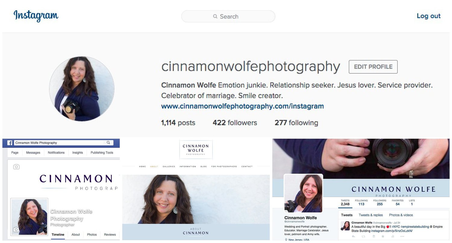
As a bonus tip, make sure you photos across all social media platforms are branded and similar. If a client sees a professional photo of you on your website and then clicks over to Twitter and sees you and four of your friends at the latest T-Swift concert and then clicks your FB page and sees a photo of a person that looks nothing like the other photos (because you opted to make your fb profile picture a picture that you TOOK, not that is of you) and then they click your IG and see a photo of a baby, they are going to be confused! Make them branded and consistent. Make it easy for your potential clients to know what to expect!
(This is an old photo collage from my various social media accounts)
Helps you attract your ideal client
Whomever you have decided is that perfect client fit for you, your branded photos can help attract that type of client. If you are looking for spirited brides you might want to post a photo of your laughing and having a great time. If you are looking for more romantic, classic brides, you might want a photo of yourself in a flower crown in a field. If your aim is iconic, timeless and more reserved brides, you might want a black and white photo of yourself with a more reserved expression. If your ideal bride is quirky and alternative, maybe you want to show off your own quirky, alternative style in your photos.
Whatever it is that you are looking to attract is likely an extension of who you are inherently even though there may be minor differences. Photos of yourself on your website and social media is one additional way you can work to attract your ideal client through consistent branded images.
Provides a sense of comfort
I consider photography to be a very intimate thing. Stepping in front of a lens can be terrifying for some people and for most people it's at least a little awkward. Letting people "in" and letting them see you well before you meet up in person for whatever type of photo session you are doing makes the whole process more comfortable for them. They won't have to wonder how they will find you at the location. They won't have to worry about you being totally different from how you verbally represented yourself online. Comfortable clients equal happy clients who talk about you to their friends. If you haven't already added your photo do your website or social media....do it now! =)
3 | A WAY TO FOLLOW YOUR BLOG
If you are a photographer who has decided to blog, by all means provide me a way to see your posts if I want to!
This is something that confuses me every time I run into it. I have happened across many different photography or educational blogs that have some fantastic material but short of just bookmarking their site and maybe remembering to go back and check in with it, there is no way for me to directly follow their blog from their blog. This is a huge missed opportunity.
If you are taking the time and effort to actually craft blog posts with great content, make it easy for people to access and share that information!
If I have to open up bloglovin, search around and hopefully find your blog, and then follow I just might not have the time or the energy in that moment to go through all those steps. If I had a simple sidebar button or opt in box on that page, my life has just become much easier and the probability that I will sign up has increased greatly!
If you are blogging strictly for SEO purposes, maybe you aren't really interested in others following along with your blog posts, but I feel that is a rarity. There is so much content out there already, that if you aren't being smart about the way you craft and share your content then it will simply get lost in the madness of the internet. If any part of your blogging purpose involves creating content that helps people then by all means, help them by making it easy for them to sign up!
This should be a good time to mention that you can sign up for these posts through the Bloglovin' button on my sidebar or you can also join the IN CROWD for more email goodies, info and strategy for your business! PLUS you get a free download of 100 blogging ideas. Yes, please!
and last but not least....
4 | Your email address
PLEASE, please please include your actual email address SOMEWHERE on your site!!! Not every single person who visits your website needs to contact you through your contact form I promise! And if some people have to go through the rigamaroll (is that a word?) of filling out your contact form, they might just forgo contacting you all together.
As associate editor for Red Oak Weddings I need to email vendors all the time and sometimes if they don't have an easy to find email address (because I just need to send them info, I don't need to fill out a huge form JUST to even get their email address) then they might actually just miss out on what I need to say b/c the process is too lengthy to get in touch with them.
Put your email address somewhere on your site. In your footer, on your contact page, I don't care where...just do it!!
Ok, rant over. Thanks for bearing with me. ;-)


