How to create an Anti-Boring blog post in Squarespace
I'm quite sure it's no one's actual intention to create a boring blog post (on Squarespace or any other platform for that matter) but the unfortunate truth is that more times than not, bloggers have great ideas but their execution is poor.
The popularity of blogs in the past 10 years and the crazy insane number of blogs out there (150 million plus!!!!) has led to some very interesting data and strategies. Gone are the days when you just type some of your thoughts down onto a webpage and click submit.
There are many different strategies you can implement TODAY to make your blog posts more interesting and more readable which in turns will hopefully turn into more readers and more loyal readers. That should ultimately positively affect your bottom line. Who doesn't want that?
ADD IMAGES
The first and easiest ways to add interest to your blog post is by adding images. We are a very visual society and even though the main focus of any blog post is typically conveying some sort of message through written words, using images to add context, texture and interest to that story keeps your readers eyes moving and breaks up the monotony of reading rows and rows of text that seem to never end.
Images also can convey very quickly what your blog post is about, a point you are trying to make or they can show your reader what you are talking about. Anyone else out there prefer cookbooks that include pictures instead of just recipes?
I'm raising my hand!!!
And I even go one step further and prefer watching videos or cooking shows so I can watch the entire process from start to finish. That is so much easier for me than reading a recipe and trying to figure it out.
This is one of the reasons I started implementing videos into my blog posts. Sometimes it helps 100% to see the process being done rather than reading about it. Luckily technology is at a point that this is really simple to do!
In Squarespace....
Use Image blocks or gallery blocks to add images throughout your post.
click on the insert point in your blog post where you want to insert the image
upload the image
add the description (don't forget this!! very important for SEO)
decide if you want to caption or not
add a link if necessary
BREAK IT UP
Utilize formatting. ALL DAY. No one likes to admit it, but we all SKIMM. The first thing I do when I open up an informative blog post is skim for the headers to get a general gist of the info that is being covered. THEN I can determine if its worth my time to actually go through and read ALL the words on the page. If I open up a blog post and it's one big blob of text without any breaks, headers, bullets etc....my desire to dig into the meat of the post crashes and burns almost instantly.
When I worked in Human Resources, this was a key element we would talk to employees about when they submitted resumes for promotions. Don't list all of your skills and abilities or job duties in one giant paragraph. Bullet point everything so it makes it easier for the hiring manager to quickly see what you are all about.
The same theory applies here. Make it easier for your readers to invest in your post. Most people who read blogs look at 10+ blog posts a day...don't let yours be one of the first to get clicked out of because of a hard to read format!
In Squarespace...
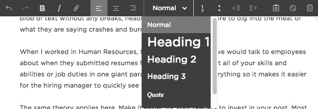
Utilize the formating functions in your text block. I typically use Heading 2 and Heading 3 for my posts.
WHITE SPACE BABY
Up until about two years ago, the concept of white space never really occurred to me before. Kind of makes sense being that I am not nor have I ever studied design, but white space and proper usage of that white space can be a huge draw to blog readers.
Have you ever clicked on a site that had an all black background and white text?
Have you ever clicked on a site that had a patterned or textured background with text on top of it that was almost impossible to read?
Have you ever clicked on a site where everything seemed jumbled and out of sorts and on top of each other and too small or too large and on and on and on....?
Proper utilization of white space in your blog posts can help your reader navigate the page, engage with the post and it's easy on the eyes. Squarespace has the added bonus of being ALL ABOUT great use of white space and you can take it even further by adding line blocks in your post or spacer blocks as well!
In Squarespace....
Insert line blocks to create more white space and break up your post visually or add spacer blocks to create space in between elements of your post.
SUMMARY BLOCKS
If you have followed my blog for any bit of time you are probably pretty familiar with my love affair with the Squarespace summary blocks. Despite the fact that it still doesn't allow things to pull in randomly, I think summary blocks are always a great addition to add at the end of EVERY blog post to let your readers have quick visibility to relevant and older content on your site.
If someone clicks your post and skims the headings and doesn't see any info new or helpful to them BUT then gets to the end of your post and sees an older post that DOES have info that they are interested in then BOOM. You've kept a reader on your site longer than you would have if they hadn't had that quick visibility into your past content.
Squarespace summary blocks FOR THE WIN.
Just go check out this blog post....trust me.
VIDEO
I have a feeling that video is kind of sort of maybe possibly the wave of the future. Have you seen a facebook newsfeed these days? Video after video after video. YouTube is HUGE. I wouldn't have been able to fix the washing machine without the beauty of five different 2 minute videos on youtube.
Don't get me wrong there are tons of people who still like to read and get their information that way, but there are just as many people who like to watch and learn and see someone else doing something. It's a powerful medium and one I'm glad I've tapped into. I hope to continue and take it even further in the future!
In Squarespace....
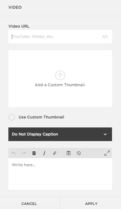
It could NOT be easier to add a video to your post. Simply create your video and upload it to your host of choice (I use Vimeo) and then add a video block!
GRAPHS AND CHARTS
This is not something I've utilized in my posts simply because my subject matter doesn't typically necessitate a chart or a graph, but the data geek inside me loves that there is an option for this in SS and its so easy to do! I might have to make up a blog post just about some statistics just so I can utilize this feature.
BORING BLOG POSTS VS. NON BORING BLOG POSTS
Don't let this be you!
In Squarespace....
Utilize the chart blocks feature and play around with all of the fun options! Its really easy to customize!
INFOGRAPHICS
Also something I haven't used personally in my posts, mostly because I'm not a graphic designer and it would take me about a hundred years to actually put one together, but if you have the ability to create an infographic or can hire someone out to make some for you, I say go for it. Infographics are a great way to convey a lot of information in a concise way and they are HIGHLY pinnable.
In Squarespace...
Just add an image block and upload your infographic!
BIO
I've seen a lot of bloggers do this if there are more than one contributor to their blog or if they simply want to get their face and info on front of people who might be landing on the blog post without having seen the rest of the website. Its an easy and simple way to introduce the writer of the post to the audience in an aesthetically pleasing way.
In Squarespace...
Simply add an image block with your headshot and then add a text block with the info and drag them next to each other. Viola!


