How to Blog in Squarespace | Creating a Client Post
Having extensive experience blogging in both Wordpress and Squarespace, I've got to tell ya, blogging in Squarespace just wins for me. On Wordpress I lived in a constant state of worrying that I was going to break something (mostly because I completely clueless on how the system worked, despite my best attempts at learning.)
With Squarespace it's the exact opposite. I find the blogging platform to be streamlined, easy and intuitive and today we are going to be talking about how to easily build a client blog post to show off your work!
If you aren't keen on reading and following the step by step, there is a handy little video down at the bottom which takes you through my process of building a client blog post from start to finish!
CREATING A BLOG POST
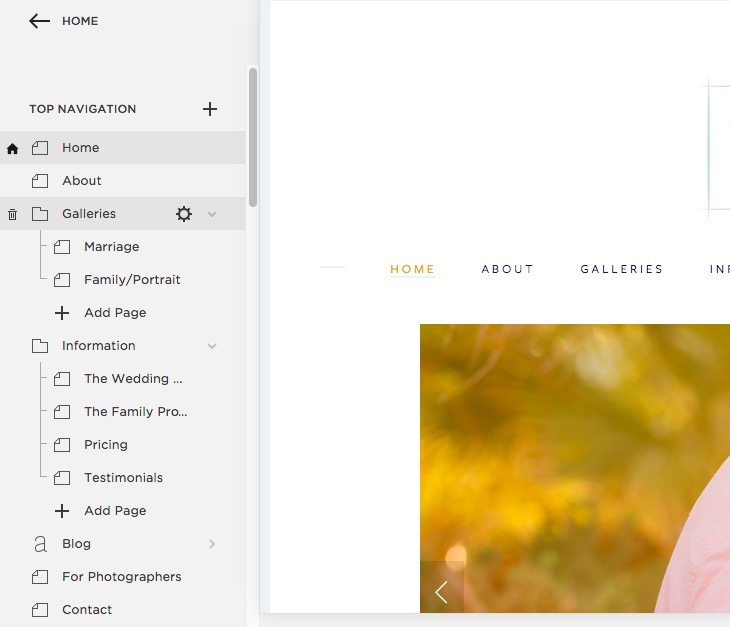
Once you are in the back end of your website click on pages > Blog. This should bring you to your blog on Squarespace.
(If you don't have a Blog set up, just click on the + next to Top Navigation and you will be able to add your blog there)
From your blog page, click the plus at the top and this will open the blog post window.
One the blog post window is open, I start by doing some "housekeeping". I enter my title, I tag and categorize the post at the bottom and then I will update the Options and Location links at the top.
I always insert a "header" or "featured" image into my posts which is not something that is normally done. I do it for branding and to differentiate my blogging, so don't think that is something you necessarily have to do. I create these square images in Adobe Illustrator and insert them as the first image in every blog post and also as the thumbnail image under "Options". Under "Location" I will enter my business name and state as well to assist with SEO.
INSERTING IMAGES
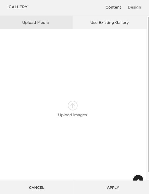
When inserting images into your post you have a few options. You can insert one image at a time using the Image block option or also upload multiple images into a stacked gallery.
BASIC FORMAT FOR CLIENT BLOG POST
My basic format for a client session blog post is the following:
Header image
Text
Stacked gallery block (with blogstomped images)
Call to action (sometimes)
Carousel summary block
Header Image
I mentioned this above, but for every post, I insert a header or featured image as the first image on the page. Sometimes I have text above that image (like in this post) and sometimes I don't.
Text
This is where I like to talk about my clients, share a little of their story or a story from the session. I hear from a lot of bloggers that this is the stuff that they have the hardest time with. They don't know what to write or they feel like no one cares.
Even though writing this text can sometimes be a challenge, I'll tell you who does care: your client. Even if everyone else who sees your blog skimms over that content and doesn't bother to read it, I guarantee your client will read it and will love it. I've had so many clients tell me that what I wrote meant a lot to them. It shows you care and that their session was more than just a transaction to you. For me, it's the best part of the whole post!
You can also utilize questionnaires to help with the text portion of the blog post. Have your client fill out a questionnaire prior to the session and then use some of their own answers to help craft the post! Brilliant!!
--->>> Want some questionnaires that are ready to go? Check out the ones available in The Collection!
Stacked Gallery
After I am done editing images from a session, I will go through and blogstomp all of the images I want to include in the post. I will include horizontal (landscape) images a few full size vertical images and then also 2 vertical images side by side. I will upload all of those images into the gallery block and then drag and drop to reorder if I feel it's necessary.
I don't choose to write text between my images in my post because I feel like it can be confusing. When I read text in between images sometimes it's not totally clear which image the text is referring too and/or it just gets missed in the scroll. I find it easier to simply write my text at the beginning or end of the post rather than fitting it in between images.
Call to Action
At the end of some posts, I may include some text and a link to my contact page asking if someone would like to book a session with me to click here. This gives a reader a quicker opportunity to reach me directly while it's fresh in their mind rather than clicking somewhere else on my website.
Summary Block
Like I mention in my Squarespace summary block post, I include summary blocks at the end of all of my blog posts. For more info about how I set them up click HERE.
And there you have it! Blogging with Squarespace does not have to be intimidating and with a few different tricks you can really make your blog posts stand out from the crowd!
Interested in WATCHING me build a blog post? Check out the video here!


