The ins and outs of the squarespace blog sidebar
Its no surprise that I'm a fan of blogging on Squarespace despite its perceived shortcomings out there in internet land. Wordpress may be the giant Wal-Mart of blogging, but I'm pretty sure that Squarespace its on it's way to being the next Target. Clean, easy to navigate, great customer service and Starbucks! (wait, that's just Target...) ;-)
I blogged with Wordpress for a few years before starting my photography business and switching everything over to Squarespace. While I felt limited with the Squarespace blogging platform initially, now I feel like the possibilities that have a really great blog through Squarespace are endless. And the BEST thing about all of it, is that it is just so easy to use. The platform is so intuitive and simple which takes a lot of the pressure out of blogging in the first place.
The blog sidebar is something I have always been huge fan of since I first started out on my blogging endeavors. I loved the idea of having a space somewhere on the page to make it easier for readers to search for other content, learn a little more about me, find social media links, sign up to subscribe and to add some contrast and interest to the page in general. Typically I have been a fan of a left and right sidebar design, but the more I am learning about blogging and long content form etc...the more I like to have as much info as possible down the one side of the page to continue giving my readers something else to click on despite where they are on the blog article.
Lets take a look at the blog sidebar options within in Squarespace as well as how to create one, how to add items to it, and what you want to make sure to include if you are interested in growing and maintaining a loyal readership!
TEMPLATES THAT OFFER A SIDEBAR OPTION
Its important to note that not ALL Squarespace templates offer a sidebar option on their blog. The following templates are ones that DO include a blog sidebar option.
***This list is as of June 2017. Squarespace does change things on occasion and may add templates in the future that offer a sidebar. If you do run across a template that offers a sidebar option and I do not have it listed above, please let me know in the comments so I can update the list!
HOW TO ADD A SIDEBAR TO YOUR BLOG
If you are using one of the above templates and do not currently see a sidebar on your blog, you need to go into your Style Editor to enable the sidebar to show.
Once you have enabled the sidebar to show on either the Left or Right side of your blog page, you will see an option to edit the Sidebar once you are back in your pages view.
EDITING YOUR BLOG SIDEBAR
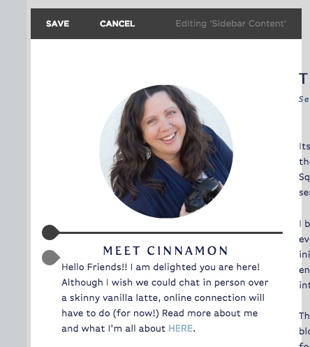
Once you start editing your blog sidebar, you will notice that it works similarly to a page. You will see insert points appear on hover and then when you click on an insert point you will be able to add content.
This is where you can really let your creativity shine. You have the ability to showcase older content, provide a search functionality, link to other pages on your website or external content, you can direct readers to sign up for a newsletter or let them know of upcoming events. You can direct them to links to your categories or tags, show them your Instagram or Twitter feeds...the options are endless!
Well, maybe not ENDLESS, but you get what I mean right?
LINKING TO CATEGORIES THROUGH IMAGES
One of my favorite ways to add some interest and color to my sidebar is to link to different blog post categories through images instead of just the standard word links that you see so often on blogs. They might look a little something like this:
Or linking to the dreaded TagCloud (which I personally can't stand, if you couldn't tell) ;-)
HOLY MOLY that hurts my eyes!!!
Instead including some branded images that will link through to your categories can be a more pleasing way to highlight more posts in that particular category
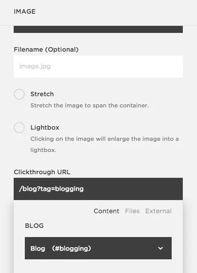
I created these little images in Illustrator to fit in with my branding and logo and then added them to the sidebar through an image block with a link to my "blogging" tag. I didn't add them for ALL of my categories or tags, just for the few that I want to highlight.
I hope this post has given you some ideas about how to incorporate a blog sidebar into your current blog or if you already have one, I hope it gave you some ideas to pump it up and make it something that fits in with your branding and strategy for blogging.
And if you aren't into reading through instructions, here is a little video about how to do all of this step by step!

