20 super duper awesome Squarespace hacks
***editors note…this blog post was originally posted in 2017 - some of these hacks and strategies may be slightly outdated and may not apply to Squarespace 7.1!
For those of you using Squarespace who love the ease and functionality of it but are also looking for a few more "tweaks" you can do to make your site really feel like "you" and also stand out somewhat from the crowd....but you are not really all that interested in crazy customizations or entering lots of code...
This post is for you!
(geeze that was a mouthful of a run on sentence!)
These are all little tips and tricks and tweaks that I've learned in my past four years of using the platform. They aren't super obvious and you can easily find how to do most of them through a simple google search, but if you are looking for a one stop place to find some great ideas of ways to update and customize your SS site....you have come to the right place!
1 | esc key log in
If you have previously signed into Squarespace on your computer and clicked "keep me logged in", when you access your website and then press the ESC key, it will automatically log you in to the back end of your website. Soooooo easy!
2 | Hide tags in blog posts
If you want to tag the heck out of your blog posts, but don't want them all showing super annoyingly in a big blob of blog post tags at the end of your post...here is some CSS for ya!
To not show tags:
.collection-type-blog article footer .tags { display: none; }
To not show tags or categories:
.collection-type-blog article footer { .tags, .categories { display: none; } }
Add this into your Custom CSS and you should be golden! (Home/Design/Custom CSS)
3 | Disable right click
If you would like to disable right click/save as on your website, here is some code for that! Enter this into your Code Injection (Settings/Advanced/Code Injection/Header)
<script src="http://ajax.googleapis.com/ajax/libs/jquery
/1.3.2/jquery.min.js" type="text/javascript"></script>
<script type="text/javascript" language="javascript">
$(function () {
$(this).bind("contextmenu", function (e) {
e.preventDefault();
});
});
</script>
4 | Summary Block
It's no secret that I am a huge fan of the summary block and its many uses. My favorites are at the bottom of blog posts, category pages, archive pages, and in your blog sidebar. If you strategize a killer category and tag system for your blog posts, you can utilize summary blocks to no end! Check out my posts about how to make them and how to use them for your archive and sidebar for more info!
5 | Buttons & Forms
I feel like buttons and forms don't get near as much love on SS as they should. These are fantastic ways to incorporate CTA's (Call to actions) throughout your site. You can customize them through your design panel and you can add click through URL's or use them as a way to collect email addresses for your email list or newsletter.
Buttons
You can use a button as a visual way to link to another page on your website, link to external content or allow visitors to download files or content that you upload.
Forms
Forms can be used for many things like your client contact form, a way to collect email addresses or even a way to do a questionnaire or survey.
6 | Cover page client guide
Ok so this is kind an out of the box idea, but have you ever considered using Squarespace cover pages as a client guide of sorts? There are some great options that allow you to put text on one side and an image on the other, which is a great way to creatively create a client or pricing guide for potential clients. All you have to do is send them the URL.
Caveat....this is a little complicated to set up (lots of linking to pages in order to guide them through as they should) and you are limited on your formatting options in the text portion, but depending on what you want to include...it could be a good option for you.
Also....it gets people actively engaged in your site and keeps them there longer (since they are looking through all the info) which is a benefit for your SEO!
Here is a super secret link to my wedding client lounge. Shhhhh! <---This is all done with cover pages!
7 | Change placement of things on page by dragging.
This one is so HUGE you guys!! This is one of the main things that I see people having trouble with on their sites.
When you go in to edit a page, the insert points go across the entire page which makes it seem like you have to design top to bottom and everything has to be on top of each other and not side by side. THIS IS NOT TRUE!!! You can totally drag things around the page and put them next to each other and make things smaller and make things bigger.
Here is a video to show you how to do this! Please watch if you feel like you struggle with this on SS...it WILL help, I promise!!
8 | Change the size of headers by placing text in description box
Want to make your headers thicker or thinner? Put text in your description box for your page or just put returns if you are not wanting to put text. This is probably best explained in a video!
9 | Home page doesn't have to be in Nav menu
That's right! You don't have to have a page in your navigation menu that says HOME. I know some like to have it there because it gives visitors an obvious place to click if they want to go back to the "main" page, but if you are looking to reduce the size of your navigation menu, by all means, drag the Home page down to the unlinked section and get it out of your nav bar. When a visitor clicks on your logo they will be taken back to your home page so visitor will still be able to access it.
10 | Add a video in a header
Yep! In most templates where you can add images into the header sections of your site, you can also embed a video to autoplay. Such a fun and interesting way to create a unique site!
Here is a great example so you can see it in action!
11 | Footer can be customized, (get rid of "powered by Squarespace")
I'm not sure why so many people miss this, but you absolutely CAN customize your footer and take out the "powered by Squarespace" text that is in most templates from the start.
I am a HUGE advocate (especially if you are a photographer or business owner in which location matters) of including your basic info and location in your footer so that it shows on every page of your website. There is nothing more frustrating for a website visitor to have to search and search and search for your location.
Want some fast Squarespace help?
check out my NEW Quick Classes!
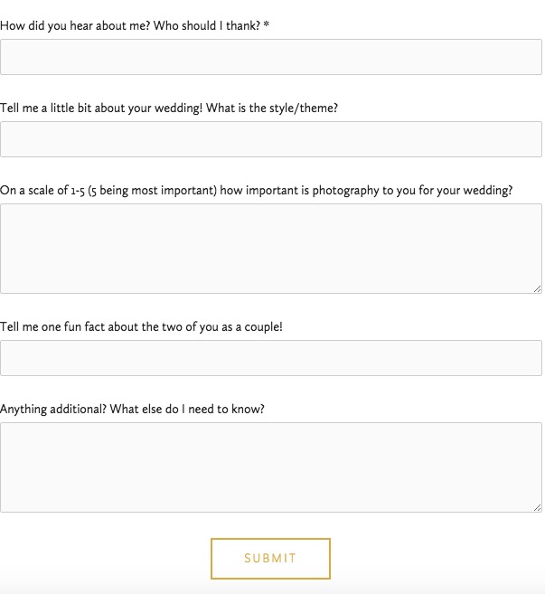
12 | Customize the contact form
For the love of Pete, people!!! Customize your contact form!!!
This is another thing I see over and over and over on websites I visit on the daily...the same 'ol boring standard contact form on the contact page that says, "name, email, subject, message". SNOOZEFEST!
You have the ability to customize that form to sound like you, to ask questions that you WANT to know the answer to RIGHT away when someone is contacting you. Don't make your visitor guess at what to say...lead them to answer questions that they KNOW how to answer and their answers will help you best serve them immediately when you respond to them.
Here is an example from my wedding contact form:
13 | Blog post title and URL can be different
Did you know that your blog post URL and the title of the post can be different??!
If you want your URL to show something SEO friendly like, "Romantic Barn New Jersey wedding at Sterlingbrook Farm" but you want the title to show "David + Jennifer"....you can totally do that!!
Here is the best way to go about it.
Create a new blog post and enter the title that you want the URL to be.
Click Save.
Go back and open that same blog post and then update the title.
The URL will stay the same but the title will change. Brilliant!
14 | Anonymous Commenting
Commenting is one of those things that the Squarespace platform doesn't have FULLY figured out yet. While I tend to think that the comment works decently, people seem to have issues figuring out how to comment on a blog post in Squarespace and if the blogger doesn't have Anonymous Commenting turned on, it can be an even bigger problem.
The default screen to pull up if you DO NOT have anonymous commenting enabled prompts the user to create a Squarespace account. People seem to miss that they can login through one of the other social media platforms and simply say "I couldn't figure out how to comment b/c it wanted me to create an account".
If you enable anonymous commenting, the option will show up to enter name, email and website which makes it much easier for visitors to comment.
If you are a blogger that cares about comments at all, you NEED to enable anonymous commenting NOW!
--->Settings/Blogging/Comment Settings/Enable anonymous commenting
15 | Use cover page as landing page for opt-in
Landing pages are super popular. For good reason.
When you use a landing page for your opt-in or email sign up, you know exactly where your people are coming from. I was adding forms on various pages for people to sign up for the In Crowd, but I was running into the problem of not setting them up all exactly the same. Now, I instead set up a coverage page (which looks a little more stylish and professional) and then I can just directly link to that page wherever I want to!
I can add a button or a photo or just link some text and send people to that page to sign up! I can also link that page directly on other places as well (facebook, other blogs etc...) to get people to exactly where they need to be to sign up!
16 | Take the date out of your blog URl
It's good SEO practice to make sure that keywords are as far "up" in your blog URL as possible. Squarespace defaults your blog URL to include the year/month/day but you can absolutely change that.
***NOTE...if you change this AFTER you have already been blogging you will need to do 301 redirects to the new URL b/c otherwise your old links will now be broken. Proceed with caution if you have already been blogging. If you are brand new and setting up your blog for the first time, you are good to go!
Here is where you change the setting: Settings/Blogging/Post URL format <----make sure there is only %t included in that box!
17 | Social Media Icons (style changes)
Another awesome thing that I loooove about SS is the ability to add your social media icons pretty much anywhere you want throughout your site. You also have the ability to change the format of the icons per block (not globally). Below I have three different social links blocks added in with different justification (left, right, center) and different formatting based on the options provided....(and there are tons more options!)
18 | Enable Pin-it button in one step
Pinning has never been easier! Set up your pinterest as a connected account and then simply go to Settings/Marketing/Pin-it Buttons. You can adjust the way the button appears as well!
19 | Send blog posts to facebook/twitter/google + / pinterest when you publish
Did you know that you can auto publish your posts to all of your social media accounts (except for Instagram of course) upon publish of your post? Just click Social on the top of your blog posts...turn "on" the accounts you want to share too...add some text that you want added to the post that is published...and viola! Once the post publishes it will push out to all of those accounts as well!
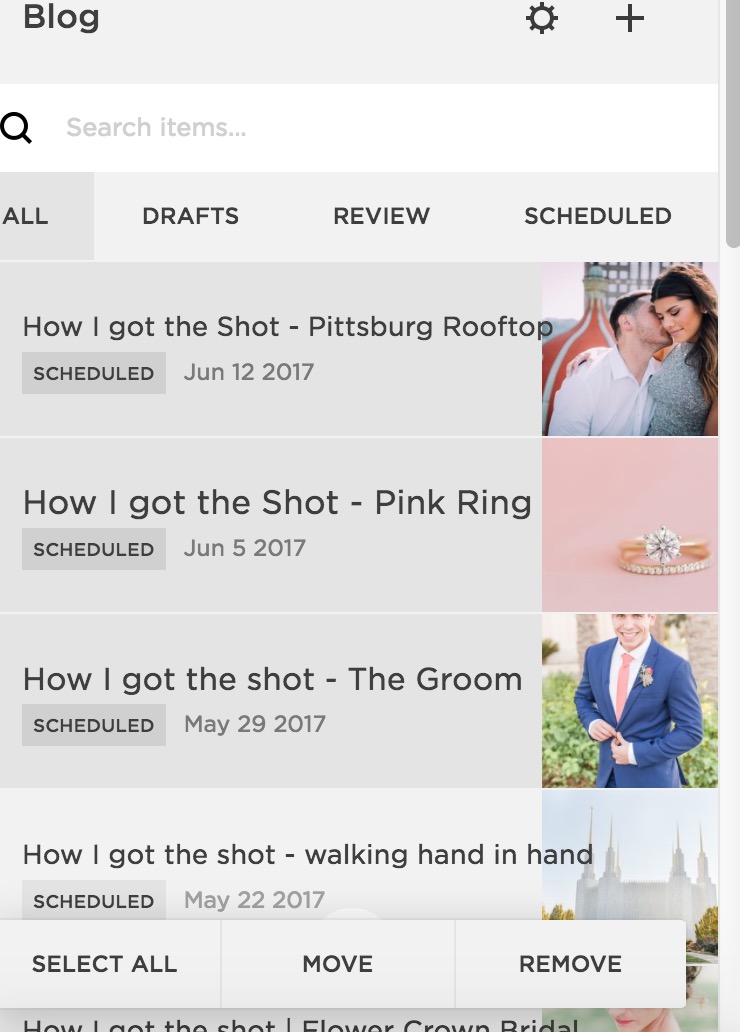
20 | You can have two different blogs
Now you might ask...why in the world would you have two different blogs? Well most people probably won't, but if you were blogging about very different things and or wanted a further way to separate or organize posts, you can totally do that.
For example on this website, I have my regular blog with all of my educational posts and then I have a separate blog for all of the Focus(ed) Podcast "blogs/episodes". That way those can all be grouped together and if I do summary blocks it won't pull from both blogs, only the one I choose.
I don't think it's all that intuitive for people to know they can actually create different blogs for different things, but you totally can. BONUS TIP...you can also move posts from one blog to the other by selecting multiple posts and then clicking MOVE at the bottom. Groovy.
Alright! I hope you learned something new about what you can do on your Squarespace site so that you can go forth and customize your site in a new and exciting way that you didn't think was possible before!


