The Squarespace Summary Block | Don't Blog without it!
Even though the original intention of Squarespace was not to be a powerful blogging platform, they have listened and responded to their users which in turn has really stepped up their game when it comes to the blogging world. They might not be shutting down Wordpress anytime soon, but anyone looking to have a Squarespace website can be assured that many of the same features desired by many bloggers are readily available through Squarespace. I have blogged with Wordpress in the past and in complete transparency, I enjoy blogging on Squarespace MORE than I ever did with Wordpress and feel that they are making a lot of beneficial changes to encourage more bloggers to use their platform.
One of my favorite features of blogging through Squarespace is the Summary Block. Once I discovered this gem, it literally changed EVERYTHING about how I blog and made my end goal of allowing my readers to have simple access to anything and everything they might need more of a reality.
While there are many uses of a summary block, I am going to show you how I incorporate the Summary Block into every single blog post I write and tell you why I do it. I also have a VIDEO at the end of the post describing the process of how to create a summary block in case you would rather watch than read.
I like to make it easy on ya!
Most bloggers are highly interested in making sure their readers are not only reading their current post, but also have access to other articles posted in the past that might also be interesting or provide useful content to that reader. Bloggers are also highly interested in keeping readers on their site to decrease their bounce rate and ultimately do on their website whatever it is that website owner wants their reader to do (click on ads, sign up or buy something etc...) Pointing your reader directly to that content is usually the easiest way to do this, but it's not always the most intuitive or "pretty.
You can add links throughout your post to indicate that if your reader clicks on that link they will be taken to an article that is related to what you are writing about. Like this. However, if the reader is really interested in your article, they may not want to click away right at that moment to go and read something else. By the time they have finished with your article, they may have forgotten to go back and click the link or they might be distracted by something else.
I have seen some bloggers add links to the bottom of their posts as well linking specifically to other content related to that post and since its at the end, it makes it more likely for readers to click over to see the additional info. I like this strategy and oftentimes incorporate it myself on certain series posts etc...
You can also add content or links to past content through your sidebar which is a fantastic method to not only provide a link to more of what your reader might want, but you can often pretty it up with graphics etc...to make the information even more appealing.
Another awesome way to show your readers older, relevant posts is to add a summary block to the end of every post you write on Squarespace.
CATEGORIES AND TAGS
Before you do this, its important to note that you should have a relatively good system in place for categorizing and tagging your blog posts. The Summary block does NOT pull the information randomly (like some Wordpress plugins do), you have to tell the block what info to pull and you do that by choosing a Category or Tag or both.
For example, for this post I have it set to the Squarespace category with tips chosen for the tag. If I choose that combination in the summary block then it will only pull the most recent posts with those exact same Categories and Tags. So if this is your first post using those choices, the block will pull up empty (because there is nothing for it to pull from.) So you might want to select a broader Category (that is still relevant) but has posts attached to it.
HOW TO CREATE A SUMMARY BLOCK
When you have reached the end of your blog post, click the insert point which brings up your block options.
You can select any of the four items, but I like to choose the Carousel for its simplicity and aesthetic.
Once selected you will have the option to update the various settings.
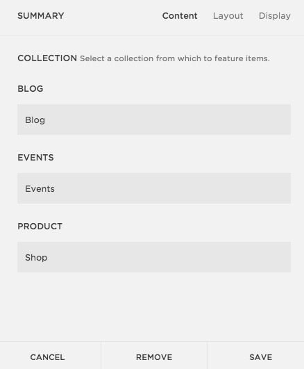
Select BLOG and then click on Layout. This is where you can change the style if you like and make other choices on how the info will be displayed. I choose Carousel, change the text to "Other posts you might like" , change the text size to Small, change the aspect ratio to 1:1 and choose 4 posts per row. I leave the text positioning and meta data as is.
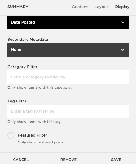
Then click over to Display. I change the number of items to display to 4 (although you can leave it at more if you like, its totally up to you), I click off Excerpt and then I choose my Category and Tag Selections.
For this post I am choosing only the category "squarespace" which will show my most recent posts that I have categorized squarespace. The good news, is that in the future, when I create another post and assign the category squarespace, it will automatically update this block on this post without me having to do anything! I consider that a total win!
As you can see its relatively easy to create a summary block at the end of every post. It makes your posts look more professional and gives your readers options to click on something else that might look interesting to them and stay on your website a little longer.
I do wish there was an option for the posts to be rotating and not always the MOST recent. I've noticed that older posts have a tendency to get buried since the summaries are always showing the latest info. I also wish that you could choose multiple categories or tags when selecting just to mix up the content a little as well.
I'm certain Squarespace will continue to build out its platform and offer solutions to these minor issues, but until then, the summary block is a fantastic addition for any blogger to use on a regular basis!


